Most people assume that changes in how they look — like appearing more tired or less vibrant — stem directly from aging. While aging does affect skin, eyes, and facial contrast, a major factor that’s often overlooked is the color of clothing worn near the face. Color isn’t just aesthetic; it actively interacts with light and skin tone, subtly shaping how others perceive features such as vibrancy, brightness, and warmth. When a garment’s hue reflects light toward the face in a flattering way, it can enhance perceived vitality and make the wearer appear more youthful. Conversely, certain shades can unintentionally accentuate shadows, fine lines, or dullness. The key is understanding that color functions like a lens that modifies visual perception — not a superficial fashion detail but a tool that communicates energy, confidence, and personal expression. Research in fashion psychology supports the idea that complexion influences color preferences and aesthetic perception, showing that people unconsciously select clothing colors that complement their skin tone and enhance how they are perceived visually.
As women age, natural changes occur in skin, hair contrast, and eye brightness — often softening the visual contrast between these elements. This shift doesn’t diminish beauty, but it means that contrast between clothing and complexion becomes more influential in how faces are perceived. Just as light can make a room feel lively or flat, clothing colors act as reflectors that can either brighten or dull the appearance of the face. Dark, overly muted, or cool hues near the face may reinforce shadows or tiredness in the complexion, while warmer, richer shades bounce light back and create a sense of glow and vitality. Stylists increasingly emphasize using color strategically — not as a limitation, but as a way to support natural radiance and personal style as aging unfolds.
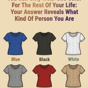
Certain colors are notorious among stylists for making mature complexions look weary or washed out. Black — often prized for sophistication and slimming effects — can absorb light near the face, casting shadows that intensify the appearance of fine lines or under-eye darkness. Similarly, deep navy carries many of the same issues, flattening the face’s brightness, while flat, ashy grays can literally suck life from the complexion. Pale pastels such as baby blue, powder pink, and washed-out lavender tend to blend too much with aging skin tones, leaving the face looking muted rather than radiant. Beige or muddy neutrals often lack the contrast needed to illuminate features, creating a dull or fatigued impression instead of a luminous one. These effects align with stylist observations and contemporary fashion advice for women over 50.
Fortunately, just as some colors can drain the face visually, others can uplift and illuminate it. Fashion experts recommend richer, more vibrant hues such as purple, which combines sophistication with freshness and helps soften and enliven facial features. Purple is noted for injecting vitality without overwhelming an outfit, making it especially flattering for women over 60. Deep jewel tones — such as teal, emerald, cobalt, and rich red hues — also provide depth and light that enhance the complexion. Softer alternatives to stark white, like creamy whites, can refresh skin tone without creating harsh contrast, while accents of turquoise, raspberry, or royal blue add glow near the face without draining warmth. These recommendations reflect both stylist experience and emerging evidence that clothing color choices align with how observers visually assess attractiveness.
Selecting flattering colors isn’t about strict rules — it’s about observing how hues interact with your unique features. Natural light is invaluable when judging whether a color makes your eyes sparkle, your skin glow, or your face look dull or shadowed. Warm neutrals like camel, taupe, and soft gray can serve as elegant bases, while deeper saturated tones — teal, plum, burgundy — boost perceived vitality. Color analysis — whether informal self-testing in natural light or consulting a stylist — helps individuals learn which palettes harmonize with their complexion by minimizing unwanted shadows and maximizing natural contrast. Accessories like scarves, statement jewelry, or even makeup can further balance and enhance chosen hues, creating a tailored visual effect without overhauling your entire wardrobe.
Reworking your wardrobe for color impact doesn’t require abandoning personal style or following every trend. Minor adjustments — like switching a washed-out pastel blouse for a richer shade, pairing dark fabrics with warm accents near the face, or choosing textured fabrics that reflect light subtly — can yield major perceptual effects. The goal is not masking age, but highlighting strength, confidence, and natural energy. Style after 50 becomes less about hiding perceived flaws and more about using color intentionally to reinforce vitality and self-expression. With thoughtful color selection, clothing becomes a supportive tool for confidence and authenticity — proving that elegance, radiance, and style flourish at any age when guided by awareness and experimentation.


